Moving to SwiftUI: using TabView instead of UITabBarController.
Русскую версию этой статьи можно найти здесь или здесь.
You may also read this article on medium.
Converting UIKit project to SwiftUI (or SUI) in 2022 is no longer a matter of time. It rather depends on availability of appropriate skills. I’ve been working for Utkonos — one of the leaders of e-commerce in the Russian market. We started to develop the application using SUI at the end of 2020 when we picked iOS 13 as the lowest supported version (yes, we’ve decided not to wait for the iOS 14). This was also triggered by the task of a complete redesign of the application. At the moment, we have implemented two main screens out of five on SUI. One of the main tasks facing iOS-developers is to implement navigation flow. It’s now rare to find a single-page application. The tab bars are used in iOS to support user interfaces where multiple screens can be accessed in no particular order. If the application is developed using SUI with no legacy code at all, then the typical development pattern is still the following: the screens are made up with SUI but the tab bar with UIKit. With the growth of the SUI-code in Utkonos, we began to gradually abandon navigation on UIKit, a big step in this direction was to convert the tab bar to the TabView instead of the UITabBarController.
Hello everyone! My name is Alexander Kraev! In this article I want to share with you my own experience of adding TabView with all the pitfalls: when you have screens developed both using SUI and UIKit. This article is not for those who have just started to learn SUI. If you are just like that, then I advise you to begin with some small features. You can find more interesting posts on my telegram channel dedicated to iOS development on SwiftUI.
Preparing the structure
In our team we work using Trunk Based Development (TDD). If you aren’t familiar with this version control management practice then I would advise you to watch this session. In one word, the development goes through Feature flags and toggles. Let’s get start with adding a toggle for a new Tab Bar on SUI:
struct SwiftUI {
    struct TabView {
        static var isActive: Bool = true
    }
}
In the part of the code where the root view controller is created for the main window we should write:
var main: UIWindow?
func createMainWindow(windowScene: UIWindowScene) {
    main = UIWindow(windowScene: windowScene)
    let mainTab = FeatureFlags.SwiftUI.TabView.isActive ?
                        UIHostingController(rootView: RootTabView()) :
                        setupTabBarController()
    main?.rootViewController = mainTab
}
setupTabBarController() is the function of creating the tab bar using UIKit, and RootTabView() is a view of the tab bar
on SUI integrated through UIHostingViewController
The flow of UIKit’s tab bar is quite familiar: navigation controller is created with the root view controller for each screen:
let profileVC: ProfileViewController = .init()
let profileNav: NavigationController = .init(rootViewController: profileVC)
First view controllers (used as navigation controllers) are created. Then, the tab bar controller is initialized:
private func setupTabBarController() -> UIViewController {
    ...
    let profileVC: ProfileViewController = .init()
    let profileNav: NavigationController = .init(rootViewController: profileVC)
    ...
    let tabbarController: TabBarController = .init()
    tabbarController.viewControllers = [..., profileNav, ...]
    return tabbarController
}
As you can see above NavigationController is a class inherited from UINavigationController but with custom behavior
of the navigation bar, its appearance of the back button and as simple as that.
Let’s go back to the SUI Tab Bar. Obviously, RootTabView() will consist of child screen views. It’s time to start writing
UIViewControllerRepresentable wrappers for view controllers on UIKit. I’ll give you an example of one for the user profile screen:
import SwiftUI

struct ProfileSUIView: UIViewControllerRepresentable {
    func makeUIViewController(context: Context) -> NavigationController {
        let profileVC: ProfileViewController = .init()
        let profileNav: NavigationController = .init(rootViewController: profileVC)
        return profileNav
    }

    func updateUIViewController(_ uiViewController: NavigationController,
                                context: Context) {
    }
}
As I said earlier, we have two screens fully developed using SUI.
In order not to break the routing between these screens and other legacy screens developed on UIKit,
we decided to wrap them also using UIViewControllerRepresentable in NavigationController:
struct CartSUIView: UIViewControllerRepresentable {
    func makeUIViewController(context: Context) -> NavigationController {

        let cartScreen = CartScreen()
            .environmentObject(...)
        let suiCartVC = UIHostingController(rootView: cartScreen)

        let cartNav: NavigationController = .init(rootViewController: suiCartVC)
        return cartNav
    }

    func updateUIViewController(_ uiViewController: NavigationController,
                                context: Context) {
    }
}
You don’t have to think about the design of the tab bar yet, we will come back to this later.
First it’s necessary to get the efficiency of the current structures.
Let’s implement RootTabView in the simplest possible way. Let’s declare an enum with screens:
enum TabType: Int {
    case main
    case catalog
    case search
    case profile
    case cart
}
Next, let’s design RootTabView {...} using icons from SF Symbols:
struct RootTabView: View {

    @State private var selectedTab: TabType = .main

    var body: some View {
        TabView(selection: $selectedTab) {
            main.tag(TabType.main)
            catalog.tag(TabType.catalog)
            search.tag(TabType.search)
            profile.tag(TabType.profile)
            cart.tag(TabType.cart)
        }
    }

    private var main: some View {
        MainSUIView()
            .tabItem {
                Label("Catalog", systemImage: "house")
            }
    }
		...
    private var profile: some View {
        ProfileSUIView()
            .tabItem {
                Label("Profile", systemImage: "person")
            }
    }

    private var cart: some View {
        CartSUIView()
            .tabItem {
                Label("Cart", systemImage: "cart")
            }
    }
}
Let’s launch the project for test to see how switching between tabs works:
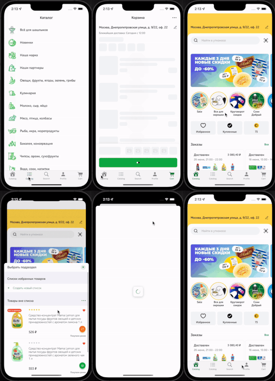
At the same time we can notice that the routing on SUI’s screens has broken:
any child screen opens as a modal, a white stripe appears in the safe area.
Let’s fix these problems one by one.
Briefly, the routing in our legacy code consists of a navigation screens enum and a factory where this enum is handled:
enum Route {
    case trackOrder
    case qrAccessCode
    case safari(String)
    ...
}
...
func route(to direction: Route,
           from viewController: UIViewController? = nil,
           previousScreen: AmplitudeScreenNames? = nil) {
    let viewController = previousScreen == .bottomSheet ?
  					UIApplication.topViewController() : viewController

    switch direction {
    case .trackOrder(let id):
        self.trackOrder(id: id, from: viewController)
    case .qrAccessCode:
        self.showQRAccessCode(from: viewController)
    case .safari(let url):
        routeToSafari(url: url)
    ....
}
If the view controller, from which we are routing, is nil then by default we take the top view controller
(you can easily google its code).
This is the reason for any view controller’s modal opening.
Top view controller in our scheme is no longer a UINavigationController or UITabBarController but a hosting view controller:
po topViewController
▿ Optional<UIViewController>
  ▿ some : <_TtGC7SwiftUI19UIHostingControllerV7Utkonos11RootTabView_: 0x139f2f640>
Previously the navigation controller could be reached this way:
po (topViewController as? UITabBarController)?.selectedViewController
▿ Optional<UIViewController>
  ▿ some : <Utkonos.NavigationController: 0x12f882600>
So now we should pass an instance of the navigation controller into SUI screens to use it with routing.
One of the possible ways to do it is to create an EnvironmentKey:
struct NavigationControllerKey: EnvironmentKey {
    static let defaultValue: UINavigationController? = nil
}

extension EnvironmentValues {
    var navigationController: NavigationControllerKey.Value {
        get {
            return self[NavigationControllerKey.self]
        }
        set {
            self[NavigationControllerKey.self] = newValue
        }
    }
}
Then declare the Environment in screen’s view:
struct CartScreen: View {
    ...
    @Environment(\.navigationController) var navigationController
    ...

    var body: some View {
    ...
    }
}
We should inject instance of navigation controller during the creating of the hosting view controller,
so the CartSUIView will be transformed to:
struct CartSUIView: UIViewControllerRepresentable {
    func makeUIViewController(context: Context) -> NavigationController {
        let cartNav: NavigationController

        let emptyView: UIViewController = UIHostingController(rootView: EmptyView())
        cartNav = NavigationController.init(rootViewController: emptyView)

        let cartScreen = CartScreen()
            .environment(\.navigationController, cartNav)
            .environmentObject(...)
        let suiCartVC = UIHostingController(rootView: cartScreen)

        cartNav.addChild(suiCartVC) // child here is a root
        cartNav.setNavigationBarHidden(true, animated: false)

        return cartNav
    }

    func updateUIViewController(_ uiViewController: NavigationController,
                                context: Context) {
    }
}
So before injecting .environment(\.navigationController, cartNav) we should initialise an instance
of the navigation controller cartNav using a “proxying” UIHostingController with an EmptyView().
After that we can add the main screen as child: cartNav.addChild(suiCartVC).
We shouldn’t forget to hide the empty view’s navigation bar: cartNav.setNavigationBarHidden(true, animated: false).
Moreover it is necessary to hide the back button (because of the empty view) on the screen:

It is quite simple to fix such a problem by applying the following modifier:
struct CartScreen: View {

    ...
    var body: some View {
        content
            .navigationBarBackButtonHidden(true)
    }
    ...
}
Next step is injecting the dependency into all child views:
@Environment(\.navigationController) var navigationController
Note that there will be no error if we route to the same view from different screens with its own instances of the navigation controller (for example in our app we can route to a goods card screen from the main screen or from the cart screen). This is because of SwiftUI dependency graph Environment value taken from the parent view. Example of routing in view:
Button {
		Router.injected.routeToGoodsItem(goodsItemID: goods.id,
                                 from: navigationController)
} label: { ... }
Now let’s go back to the white stripe in the safe area. This can be fixed very easily. Let’s define the following modifier:
public extension View {
    @ViewBuilder
    func expandViewOutOfSafeArea(_ edges: Edge.Set = .all) -> some View {
        if #available(iOS 14, *) {
            self.ignoresSafeArea(edges: edges)
        } else {
            self.edgesIgnoringSafeArea(edges) // deprecated
        }
    }
}
and apply it to the content of tab items:
private var main: some View {
    MainSUIView()
        .expandViewOutOfSafeArea()
        .tabItem {
            Label("Catalog", systemImage: "house")
        }
}
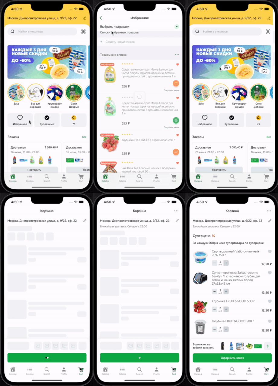
We run the app, we can see that our problems are gone:
Customizing TabView
Let’s go back to the TabBar’s layout. The TabItem(_..) modifier which is available out of the box has very limited features.
Our Tabbar is different from the basic UI of iOS, so we need to custom it. Fortunately, SUI makes it very easy to do:
struct RootTabView: View {

    @State private var selectedTab: TabType = .main

    var body: some View {

        ZStack(alignment: Alignment.bottom) {
            TabView(selection: $selectedTab) {
                main.tag(TabType.main)
                catalog.tag(TabType.catalog)
                search.tag(TabType.search)
                profile.tag(TabType.profile)
                cart.tag(TabType.cart)
            }

            HStack(spacing: 0) {
                /*
                 Здесь будем верстать кнопки
                 таб-бара
                 */
            }
        }
    }
}
Let’s take a look at different states of the TabBar buttons at the example of Cart button:



Disable state, active state with no goods in cart, active state with some (total number is in badge) goods in cart with total price in title
The design is quite simple so I’ll just provide an example of the code:
struct TabBarItem: View {

    @Environment(\.colorScheme) var colorScheme

    let icon: Image
    let title: String
    let badgeCount: Int
    let isSelected: Bool
    let itemWidth: CGFloat
    let onTap: () -> ()

    var body: some View {
        Button {
            onTap()
        } label: {
            VStack(alignment: .center, spacing: 2.0) {
                ZStack(alignment: .bottomLeading) {
                    Circle()
                        .foregroundColor(colorScheme == .dark ? ... )
                        .frame(width: 20.0, height: 20.0)
                        .opacity(isSelected ? 1.0 : 0.0)
                    ZStack {
                        icon
                            .resizable()
                            .renderingMode(.template)
                            .frame(width: 28.0, height: 28.0)
                            .foregroundColor(isSelected ? (colorScheme == .dark ? ...) : ...)
                        Text("\(badgeCount > 99 ? "99+" : "\(badgeCount)")")
                            .kerning(0.3)
                            .lineLimit(1)
                            .truncationMode(.tail)
                            .foregroundColor(Color.white)
                            .boldFont(11)
                            .padding(.horizontal, 4)
                            .background(Color.Button.primary)
                            .cornerRadius(50)
                            .opacity(badgeCount == 0 ? 0.0 : 1.0)
                            .offset(x: 16.0, y: -8.0)
                    }
                }
                Text(title)
                    .boldFont(12.0)
                    .foregroundColor(isSelected ? (colorScheme == .dark ? ...) : ... )
            }
            .frame(width: itemWidth)
        }
        .buttonStyle(.plain)
    }
}
In the code above boldFont is a custom modifier for the font.
Note that colors for the foregroundColor, background modifiers are not included in the let properties
of view because there will be no other such tab buttons with different colors in the app,
otherwise I would recommend to add colors in the properties.
We organize our project in modular way.
UI elements such as the tab bar buttons were placed in a separate package called UtkonosUI.

I advise you to organize your code this way.
Let’s see on RootTabView:
struct RootTabView: View {
    @Environment(\.colorScheme) var colorScheme
    @State private var cartCount: Int = 0
    @State private var cartTitle: String = "Shopping cart".localized

    @State private var selectedTab: TabType = .main

    var body: some View {
        GeometryReader { geometry in
            ZStack(alignment: Alignment.bottom) {
                TabView(selection: $selectedTab) {
                    main.tag(TabType.main)
                    catalog.tag(TabType.catalog)
                    search.tag(TabType.search)
                    profile.tag(TabType.profile)
                    cart.tag(TabType.cart)
                }

                HStack(spacing: 0) {
                    TabBarItem(icon: Image.TabBar.home,
                               title: "Utkonos".localized,
                               badgeCount: 0,
                               isSelected: selectedTab ==  .main,
                               itemWidth: geometry.size.width / 5) {
                        selectedTab = .main
                    }
										...
                    TabBarItem(icon: Image.TabBar.cart,
                               title: cartTitle,
                               badgeCount: cartCount,
                               isSelected: selectedTab == .cart,
                               itemWidth: geometry.size.width / 5) {
                        selectedTab = .cart
                    }
                }
            }
        }
        .onCartChanged { count, price in
            ...
            cartTitle = price == 0 ? "Shopping cart".localized : price.stringCurrency
	    			cartCount = count
            ...
        }
    }

    private var main: some View {
        MainSUIView()
            .expandViewOutOfSafeArea()
    }
  	...
}
In the code above onCartChanged modifier returns a View with modified cart button title.
Its implementation is quite simple. It is built around onReceive of the necessary event in the NotificationCenter.
Launching the app:

Bingo! Buttons are drawn correctly, changing the badge and title also works.
But the Tab Bar buttons move up when the keyboard appears.
This bug is fixed with the modifier: ignoresSafeArea(.keyboard):
  struct RootTabView: View {
    ...
    var body: some View {
        GeometryReader { geometry in
            ZStack(alignment: Alignment.bottom) {
                TabView(selection: $selectedTab) {
                	...
                }

                HStack(spacing: 0) {
		   						...
                }
            }
        }.ignoresSafeArea(.keyboard)
    }
}
Applying the animation
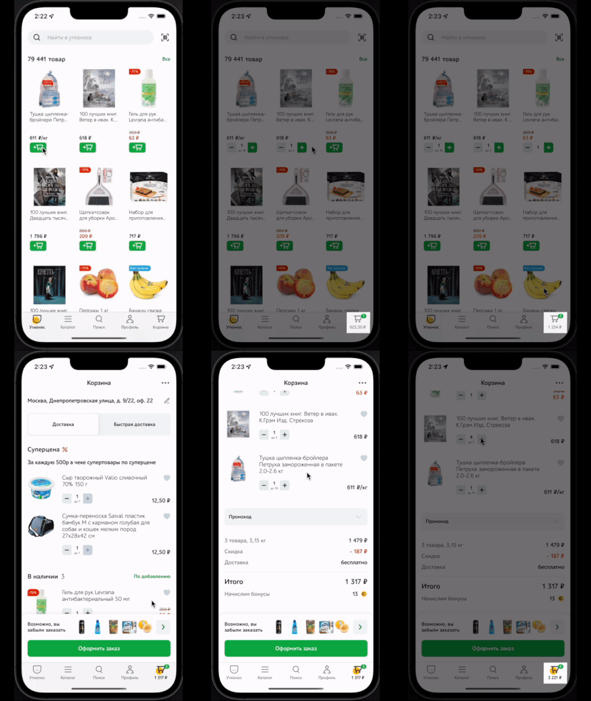
It is quite rare when designers limit themselves only to drawing buttons in Figma forgetting about animation. Moreover successful animation makes the application comfortable for using but doesn’t distract the user. Maybe the main goal of animation is to help users to get some response from the app content. In our case animation feedbacks the user that their cart has changed after goods were added.

It looks really stylish! Let’s implement it.
We need an array of coordinates with the offsets for the icon and the current offset index in this array:
struct RootTabView: View {
    ...
    private let offsets: [CGPoint] = [.init(x: 0, y: 0),
                                      .init(x: 0, y: 4),
                                      .init(x: 0, y: 0)]
    @State private var currentOffsetIndex: Int = 0

    var body: some View {
        ...
    }
}
In the onCartChanged modifier described above we will change the currentOffsetIndex in a loop over the entire array of offsets:
struct RootTabView: View {
    ...
    private let offsets: [CGPoint] = [.init(x: 0, y: 0),
                                      .init(x: 0, y: 4),
                                      .init(x: 0, y: 0)]
    @State private var currentOffsetIndex: Int = 0

    var body: some View {
        content
        ...
            .onCartChanged { count, price in
                ...
                withAnimation {
                    for index in 1..<offsets.count {
                        Task.delayed(byTimeInterval: Double(index)/10) {
                            await MainActor.run {
                                currentOffsetIndex = index

                                if index == 1 {
                                    cartCount = count
                                    cartTitle = price == 0 ? "Shopping cart".localized : price.stringCurrency
                                }
                            }
                        }
                    }
                }
                ...
            }
        ...
    }
    ...
}
Task.delayed(byTimeInterval: ...) is actually the same as asyncAfter(deadline:execute) in the New Concurrency Model.
public extension Task where Failure == Error {
    @discardableResult
    public static func delayed(
        byTimeInterval delayInterval: TimeInterval,
        priority: TaskPriority? = nil,
        operation: @escaping @Sendable () async throws -> Success
    ) -> Task {
        Task(priority: priority) {
            let delay = UInt64(delayInterval * 1_000_000_000)
            try await Task<Never, Never>.sleep(nanoseconds: delay)
            return try await operation()
        }
    }
}
We wrap into await MainActor.run {...} because property State properties isolated to global actor ‘MainActor’
can not be mutated from a non-isolated context.
Now let ‘s get down to the most interesting part — the modifier offset combined with spring animation.
.offset(x: offsets[currentOffsetIndex].x,
        y: offsets[currentOffsetIndex].y)
    .animation(.spring(response: 0.15,
                       dampingFraction: 0.75,
                       blendDuration: 0),
               value: currentOffsetIndex)
Where should we apply it? Obviously, the icon with the badge should be offset:
public struct TabBarItem: View {

    ...

    public var body: some View {
        Button {
            ...
        } label: {
            VStack(...) {
                ZStack(...) {
                    ...
                    ZStack {
                        icon
                            ...
                        Text(...)
                            ...
                    }
                    .offset(x: offsets[currentOffsetIndex].x,
                            y: offsets[currentOffsetIndex].y)
                    .animation(.spring(response: 0.15,
                                       dampingFraction: 0.75,
                                       blendDuration: 0),
                               value: currentOffsetIndex)
                }
                ...
            }
            ...
        }
        ...
    }
}
But what if the designer suggests to add another animation that is no longer related to the offset.
Let’s pass the modifier for animation in the TabBarItem as parameter, we should define TabBarItem as a generic:
public struct TabBarItem<VModifier>: View where VModifier: ViewModifier {

    ...
    let animation: VModifier
    ...

    public init(...,
         animation: VModifier,
            ...) {
      	...
        self.animation = animation
      	...
    }

    public var body: some View {
        Button {
            onTap()
        } label: {
            VStack(alignment: .center, spacing: 2.0) {
                ZStack(alignment: .bottomLeading) {
                    ...
                    ZStack {
                        icon
                            .resizable()
                            ...
                        Text("\(badgeCount > 99 ? "99+" : "\(badgeCount)")")
                            ...
                    }
                    .modifier(animation)
                }
                ...
            }
            ...
        }
        ...
    }
}
But I need a way to skip the parameter animation when creating TabBarItem.
Let’s create an extension:
public extension TabBarItem where VModifier == EmptyModifier {
    public init(icon: Image,
         title: String,
         badgeCount: Int,
         isSelected: Bool,
         itemWidth: CGFloat,
         onTap: @escaping () -> ()) {
        self.icon = icon
        self.title = title
        self.badgeCount = badgeCount
        self.isSelected = isSelected
        self.itemWidth = itemWidth
        self.onTap = onTap
        self.animation = EmptyModifier()
    }
}
Now we need a modifier for animation from the outside to pass it as a parameter to TabBarItem.
There was an AnimatableModifier protocol for such purposes earlier,
but Apple deprecate it. Instead of this we should use Animatable:
public struct OffsetAnimation<V>: Animatable, ViewModifier where V: Equatable {

    private var offset: CGPoint
    private var value: V

    public init(offset: CGPoint,
                value: V) {
        self.offset = offset
        self.value = value
    }

    public var animatableData: CGPoint {
        get { offset }
        set { offset = newValue }
    }

    public func body(content: Content) -> some View {
        content
            .offset(x: offset.x, y: offset.y)
            .animation(.spring(response: 0.15,
                               dampingFraction: 0.75,
                               blendDuration: 0),
                       value: value)
    }

}
Note that animatableData is the data for animation, in our case this is the offset point as CGPoint.
An important thing that Apple deprecates the animation(_:) modifier, which definitely creates a lot of bugs with animation.
Instead of deprecated one Apple recommends to use animation(:value:).
The main point of the last one is to play the animation when the specific value changes. That’s why our OffsetAnimation is a generic ViewModifier because of this value as a parameter.
So code of RootTabView with an animated button is below:
struct RootTabView: View {
    ...
    private let offsets: [CGPoint] = [.init(x: 0, y: 0),
                                      .init(x: 0, y: 4),
                                      .init(x: 0, y: 0)]
    @State private var currentOffsetIndex: Int = 0

    var body: some View {
        GeometryReader { geometry in
            ZStack(alignment: Alignment.bottom) {
                TabView(selection: $selectedTab) {
                    ...
                    cart.tag(TabType.cart)
                }

                HStack(spacing: 0) {
                    ...
                    TabBarItem(icon: Image.TabBar.cart,
                               title: cartTitle,
                               badgeCount: cartCount,
                               isSelected: selectedTab == .cart,
                               itemWidth: geometry.size.width / 5,
                               animation: OffsetAnimation(offset: offsets[currentOffsetIndex],
                                                          value: currentOffsetIndex)) {
                        selectedTab = .cart
                    }
                }
            }
        }
        ...
            .onCartChanged { count, price in
                ...
                withAnimation {
                    for index in 1..<offsets.count {
                        Task.delayed(byTimeInterval: Double(index)/10) {
                            await MainActor.run {
                                currentOffsetIndex = index

                                if index == 1 {
                                    cartCount = count
                                    cartTitle = price == 0 ? "Shopping cart".localized : price.stringCurrency
                                }
                            }
                        }
                    }
                }
                ...
            }
        ...
    }
    ...
}
Let’s run the app! Don’t you think it’s really cool?
Final refactoring
Let’s now move the State proprerty selectedTab property out of the RootTabView:
struct RootTabView: View {
    ...
    @State private var selectedTab : TabType = .main
    ...
}
In our project we use the MVVM-S architecture. Special service is responsible for routing, we will transfer selectedTab into it:
final class Router : ObservableObject {
    ...
    @Published public var selectedTab: TabType = .main
    ...

    func openTabCart() {
        selectedTab = .cart
    }
    ...
}
Final implementation of RootTabView is below:
struct RootTabView: View {
    ...
    @ObservedObject private var router: Router
    ...

    var body: some View {
        TabView(selection: $router.selectedTab) {
            ...
            cart.tag(TabType.cart)
        }

        ...
        TabBarItem(...) {
            router.openTabCart()
        }
        ...
    }
}
That’s all for now! Thank you for reading till the end! Subscribe to my Telegram channel dedicated to iOS development using SwiftUI.